Metropolis
Columbia GSAPP
Tutor : Enrique Walker
Building : Museum of Art and Design (MAD)
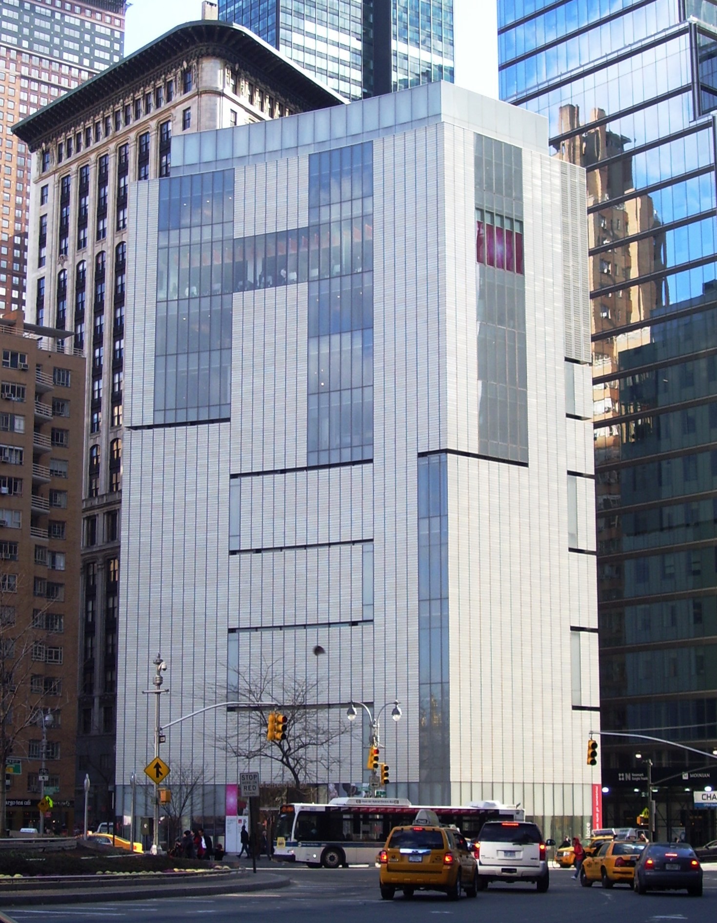
On arriving at Columbus circle when I first looked at the building it seemed like a monolith standing against the restrained glass landscape of the New York skyline. The Museum explores the blurred zone between art, design, and craft today. And the ways in which artists and designers from around the world transform materials. On the lower floors, a ribbon of cuts brings light and views into the galleries. The upper floors, which hold offices, education programs, event space, and a restaurant, have floor-to-ceiling windows. The building also has a whole floor, the sixth, devoted to education, with studios where artists can work while visitors look on.
Brad Cloepfil’s clean surgical incision, which runs across the gallery floors and ceilings as well as up the exterior façade arises from its violence as if the very structure that holds the building together is being cut away. The building was originally designed by Edward Durell which essentially had a blank façade for efficiency of artificial lighting in the gallery areas.
On going closer to the building entrance the spectral glass façade caught my attention, the mysterious frosted glass quality compelled my eyes into travelling deeper into the interiors of the space. On The ground floor of the museum store selling crockery and art prints. Then suddenly I noticed a few stone arches shaped like lollipop on the perimeter of the store. The arches almost missed my eyes because the exterior façade did not align to the grid of the arches. Seemed like skin of the facade almost wrapped around the building with deliberate asymmetry. The inside of the museum was in discord with the outside. Why does it show this violent streak of inconsideration? I assumed it to be a renovation project. And that Brad Cloepfil had made it evident through these architectural gestures his intention of restoring the building’s identity without ripping out its soul.
I instantly felt this urge to look at the building again from a distance and noticed that it had a crescent façade. The gravity of the Columbus circle pulled me towards the center and I found myself into a whirlpool of cars running around me and the Art and Design museum along with the Time Warner building forming a perfect arc. After internalizing the context I still felt a certain absence.
It seemed as if the skin of this building belonged to someplace else. It lacked the presence of a typical New York (Times Square) face of advertisements bleeding out to the city. The grey tiled façade made it apparent that an advertisement would pop out of the façade any second. It felt uncomfortable. The architects intention of creating a sense of simulation without its presence, of promising an emergence of advertisements but not fulfilling it made me wonder if he wanted the Museum of Art and Design to be a building which simulates contemplation rather than the image of the commodified world.

